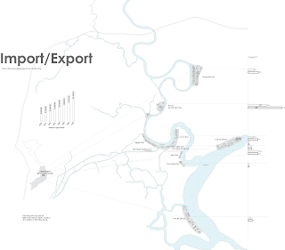
We now take a look at Vietnam. Phase one involves the analysis of Ho Chi Minh City and it's surroundings. We concentrate on what makes the city work, things that make the city become what it is.
Based on Ms. Lyster's article titled "Landscapes of Exchange: Re-articulating Site" I decided to dwell on the Imports and Exports traffic in Vietnam. Many of the ports are located in and around Ho Chi Minh City making the city the hub of the trade network.
Friday, November 6, 2009
Thursday, November 5, 2009
Back to the books..... and plots......
Here we are back and somewhat fully recovered from the Spring 2009 Semester. We're challenged already with a huge site as we kickoff the Fall 2009 semester. Well.... all we can do is take it a step at a time.
This semester's objective is to concentrate on urban design in the city of Ho Chi Minh, Vietnam.... click here to learn more.
But before all that fun starts we're giving a warm-up assignment. I'm relieved because that's exactly what I needed.......
This semester's objective is to concentrate on urban design in the city of Ho Chi Minh, Vietnam.... click here to learn more.
But before all that fun starts we're giving a warm-up assignment. I'm relieved because that's exactly what I needed.......
Wednesday, May 13, 2009
Designing never rest....

It's the end of the semester and things have gotten a little more calm. The requirement for us as students to observe new developments in architecture has been lifted, but it should remain a requirement for us to continue the study without our professors. That's what it takes to be the best. This is just a little picture of what's going on currently.
Thursday, May 7, 2009
Jury day...
Tuesday, May 5, 2009
Week 15
Friday, April 24, 2009
Friday, April 17, 2009
Week 13
Wednesday, April 15, 2009
The 3D begins....
Wednesday, April 8, 2009
Week 12
We started our detailed section drawing by hand and digitally to further explain our design. This was and still is an interesting process in where the little details that make the design work are presented.
I also found out this week that the way I was applying my skin wasn't working.... so it was back to the skin detail for me..... Below I show why the skins don't really work.

I also found out this week that the way I was applying my skin wasn't working.... so it was back to the skin detail for me..... Below I show why the skins don't really work.

Monday, April 6, 2009
Now for the progress....
Friday, March 27, 2009
Well the next week comes, and I barely have anything to show. Still lost, I worked long and hard to come to a model that I thought was interesting. Yet I've come to realize, thanks to my critics and peer reviews, that it was problematic. It didn't make sense but here I'll show it anyways.... My goal for next week is to take a step back to what looked better and more promising.


Wednesday, February 11, 2009
..............................
Monday, February 9, 2009
The Drawer

The image of an optical illusion of a black hole was projected into the drawer of a flat file to illustrate the purpose of the drawer. The projection tries to illustrate that the drawer is more than just a storage unit, rather it is a unit used to hide beautiful work! It assist in keeping good work from the eyes of the viewers.
The project did not turn out the way it should have be. It should have concentrated more on the geometry of space around rather than tell a story. I have learned a valuable lesson while working on this project! It has shown me, from others' work, that any space can become interesting. That any space can become interesting with one simple move. I hope to use steps similar to these taken to help me become a better student. There were many works that I have to appreciate for it's great effects. Please feel free to click on the links under the "Studio Folks" title to view the intelligent works. My favorite has to be Vi's.
Thursday, January 29, 2009
Building with ADs!

Talk about an attention snatcher, the job of an AD!!! I've seen building size advertisements in California, but this weird. It's just crazy what people think about these days! I wouldn't necessary say that this is an ugly building, but I wouldn't say it's a pretty one either, but I can surely say that it pretty darn interesting. Not everything that catches your eyes and attention has to be beautiful or out right ugly! It can just be different and bizarre compared to the normal perception of a typical idea. It's a brilliant way to cover the facade of a building. I like this building though I have no opinion on how it looks. The point of the idea is the building should be more then what is typically expected. This is evidence of thinking outside the box and out of the norm! Although it is very much cluttered, it is very interesting at the same time. It's not only a building, but a gigantic billboard!
New nose!
Wednesday, January 21, 2009
This is the real beginning!
Subscribe to:
Comments (Atom)
Blogs Before
-
▼
2009
(22)
-
►
March
(6)
- Well the next week comes, and I barely have anythi...
- Floor plans started really slowly to the idea whic...
- Back to the drawing board for me........ but now ...
- Now I believe this had to be the best idea I have ...
- It was the time to capture ideas from other archit...
- It's already tough as I start to develope an idea ...
-
►
March
(6)


